Google’s look, evolved
Google has changed a lot over the past 17 years—from the range of our products to the evolution of their look and feel. And today we’re changing things up once again:
So why are we doing this now? Once upon a time, Google was one destination that you reached from one device: a desktop PC. These days, people interact with Google products across many different platforms, apps and devices—sometimes all in a single day. You expect Google to help you whenever and wherever you need it, whether it’s on your mobile phone, TV, watch, the dashboard in your car, and yes, even a desktop!
Today we’re introducing a new logo and identity family that reflects this reality and shows you when the Google magic is working for you, even on the tiniest screens. As you’ll see, we’ve taken the Google logo and branding, which were originally built for a single desktop browser page, and updated them for a world of seamless computing across an endless number of devices and different kinds of inputs (such as tap, type and talk).
It doesn’t simply tell you that you’re using Google, but also shows you how Google is working for you. For example, new elements like a colorful Google mic help you identify and interact with Google whether you’re talking, tapping or typing. Meanwhile, we’re bidding adieu to the little blue “g” icon and replacing it with a four-color “G” that matches the logo.
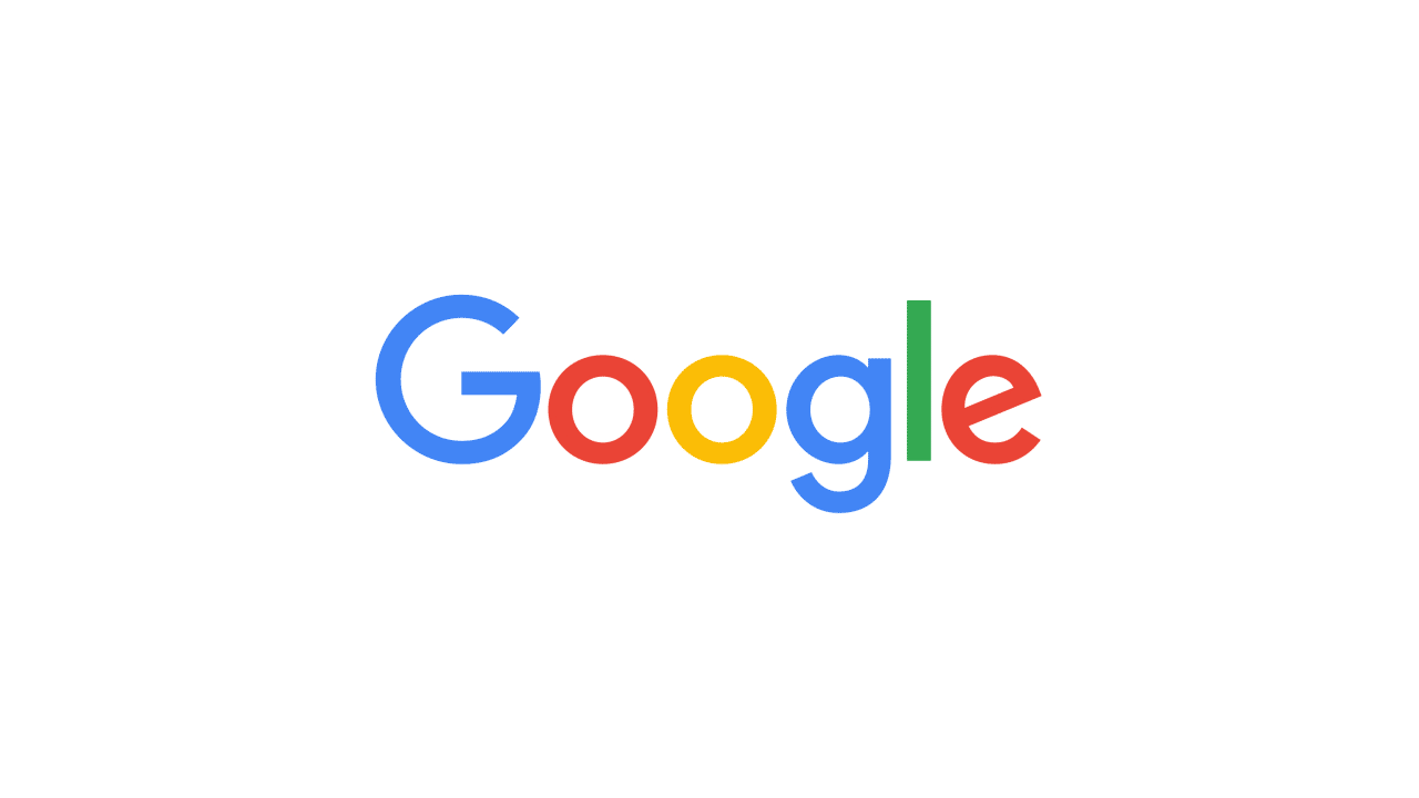
This isn’t the first time we’ve changed our look and it probably won’t be the last, but we think today’s update is a great reflection of all the ways Google works for you across Search, Maps, Gmail, Chrome and many others. We think we’ve taken the best of Google (simple, uncluttered, colorful, friendly), and recast it not just for the Google of today, but for the Google of the future.
You’ll see the new design roll out across our products soon. Hope you enjoy it!